Re-imagining Ribbons UI / Layout

Finally joining the convo after some time with Ribbons. I will say after a bit of time, the interface isn’t bad, especially with all the LED interaction. But the re-arranging of the pages as others have outlined would make it much more intuitive. I’m a big fan of clean and simplistic graphic design on the pedal face tho!

3 Likes

I really agree with @randycrouton . thats all i got to say.

1 Like

lol John I updated your firmware today and you have exactly the thematic/improved layout he was asking for! You goofus. :rofl:

@jaakjensen just a little online goofin, bud

This is kind of a UI thing, but for F&W rate, could the LEDs blink at the rate?

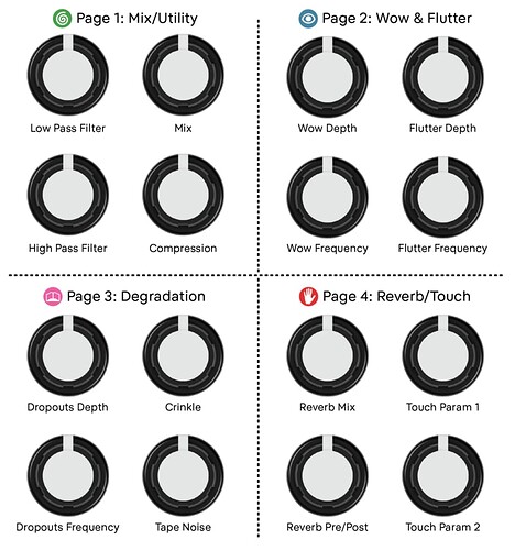
FYI everyone, the newest firmware v0.2 has been released and it will update the UI to the new layout, which is almost identical to the layout recommended by @PeterBregman and @randycrouton

Only difference is I put the LPF and HPF on the left side of page 1 (for ergonomic reasons; I wanted to be able to access both with the same hand and minimal movement) and separated the wow depth and flutter depth so they’re two knobs now.

Stop by the Development Blog for the change list and to download the WAV file you need to update things.
1 Like

They could but I feel like that might get a little confusing because none of the other LEDs blink to convey their rate. I’ll keep it in mind though and if it’s a common request I could maybe implement it.

2 Likes

just wanted to say this has been immensely helpful for me! i don’t think i would need different graphics on the pedal itself, after using this new layout for just about an hour, they seem to fit the parameters in my mind now (for some reason the spiral seems filtery to me, the open eyes just says ‘WOW’ the books makes me think ‘crinkled paper’ and the hand for ‘touch’ is perfect). haha, i don’t know if every user will want to create mnemonic devices to remember the parameters but it works for me. also i WOULD beta test the thirty foot oboe if you ever decide to go that route.

1 Like

I have one UI request:

When I press the Push button, I would love for it to stay on the page that it’s currently on for that initial first push. Frequently I find myself wanting to push the button simply to see what Page I’m on since the UI defaults away from the Page display function, thus more often than not I’m having to press the button four times just to run back around to where I started. I hope that makes sense.

Perhaps another thought would be to be able to display Page location at all times by having that LED blink, or something similar.

1 Like

I know the feeling! I remember doing the same thing a lot when I first implemented the pages. Definitely open to that request but I would need some more feedback from others to justify looking into it.

The color of the parameter LEDs communicate the current page, even after the page indicator disappears. After some use it should be easy to remember:

Page/Track 1: Green
Page/Track 2: Blue
Page/Track 3: Pink
Page/Track 4: Red

1 Like

Ahhh, I didn’t realize this, and this is helpful.

That said, it is a little confusing to me kind of having two systems (location-based blinking single LED vs all four LEDs blinking a specific color) being used to communicate the same thing.

I agree that it’s likely easy enough to remember after some use, but I also personally tend to find such things as at least something of a turnoff after having spent any decent amount of time away from a piece of gear as I’ll inevitably forget what color goes with what page and I’ll have to relearn that shorthand all over again simply to interact with the instrument, thus I always place great value on consistency and simplicity in such situations.

1 Like

I understand the confusion but I also think it’s important to give the user a sense of where parameters are currently set when they change pages.

Say you’re on page 1 and you change to page 2: if only the page 2 LED lights up, you might wonder to yourself, “ok, now I’m on page 2… but what are the current settings on page 2?”. You wouldn’t have a way of knowing unless the LEDs give you a hint (like they currently do).

In-general I’m sure Ribbons would be more immediate and straight forward if I did single-knob, single-function. There are a number of reasons why I didn’t go this route. Here are a few:

  1. Ribbons would be much larger/Microcosm-sized if I used 16 knobs… Something I’m not a huge fan of. :cry:
  2. Cost/unit would have increased by $75 to cover the cost of additional pots and labor to attach them. Also would have been a much bigger investment for me to purchase 4x as many pots for a production run.
  3. If I just used 4 knobs and did single knob/single function it would be hard to justify using an advanced DSP and hi-fi audio codec and only give the user four parameters.

Four knobs with four layers and good visual feedback felt like a decent way to reduce cost and still give the user lots of things to explore. I still think some improvements can be made - I’m hoping that, with some updates to the artwork it should be a bit more immediate and easy to use.

One-knob-per-function (OKPF) would be great, and if it only cost $75 more it would probably be really interesting - although I also know folks like pedals to be compact. For me, I don’t care about that since I use my stuff in my studio. Perhaps an updated version someday that is much larger? That said - the Microcosm itself is not straightforward to use and confuses me plenty - and isn’t OKPF (and I know that wasn’t your point - your point was that you were comparing it for size only). I definitely would have a huge interest in a OKPF pedal like this too if you decide to try this route in the future.

I can’t say I have a whole lot to comment on regarding pressing the button to know which page you’re on. I understand why someone would want it and agree that I too like that option (like pressing it with a time-out period of 2 seconds just to know where you’re at). Nice to know the pages are lit up - but unless you memorize it (which if it’s the only pedal you’ve got) it can be harder to understand than just quick-pressing the button just to confirm where you’re at.

Now, if the parameters are labeled in a circle and color coded matching the LEDs, THEN it would be extremely easy to know where you’re at.

Just my two cents on the subject!

2 Likes

Am I getting warmer? :sweat_smile:

I have ~20 other variations but this is the one I’m liking the most at the moment.

2 Likes

That looks really nice actually! Do you think it’s possible to color-code the names for the pages they belong to? I’d be nervous the text in that color itself might look funky and make it hard to read.

Is it possible to have under the text like LP . WD . DD . RM, that are color coded for the page?

I can’t quite seem to figure out how to demonstrate that in the text here unfortunately, but that might be the best way to implement that concept… what do you think?

1 Like

Like this? I can’t think of a way of color-coding the letters without it starting to feel tacky… :confused:

Now that the pages are color coded, I’m not sure if it’s really necessary to color code the text above the knobs too. Like, the pages are 1,2,3,4… so you can look at the parameters above the knob and be like ok “I’m on page 2, look at the second set of letters above the knob I want to twist”.

Also… I think I’m getting pretty close with more thematic icons:

Page 1: Mix/Utility → Swirl == mixing things together

Page 2: Wow & Flutter → One slow LFO for Wow and a faster LFO for Flutter

Page 3: Degradation → White noise / random signal

Page 4: Touch / Reverb → I think the hand does a pretty good job of conveying “Touch”

1 Like

I love the design with the colors underneath the text for the 4 parts. I think that element will make it much easier to understand what page someone is on.

Secondly I think the framing of the icons as you listed is perfect. Now with the abbreviations and pages, the navigation will be much easier (I think). Obviously other will want to chime in, but I like it!!!

1 Like

Thanks for the initial feedback! :blue_heart: :blue_heart: :blue_heart: I’ll work on this a little more tomorrow and then make a dedicated post with a couple of my favorites and see what everyone thinks.

2 Likes